Practices carrying out impressive, high-quality work owe it to themselves to present themselves in the best possible light. Architecture is no different from any other industry sector in that its practitioners can really benefit by having coherent branding and a strong visual identity.
"Even when a practice’s work is really good, its image can be let down by a poor identity," points out David Tanguy, Creative Director of graphic design and branding consultancy Praline. "This can make it hard to be taken seriously by people coming to them fresh."
Given the amount of time and energy spent by practices on tenders and competitions, the overall message that a practice conveys in its branding should not be underestimated.
"Clients are more savvy about design now, and they will expect to see professionalism and attention to detail when it comes to your communications."
Tanguy believes the term ‘branding’ itself is overused and prefers to talk about ‘visual identity’. This is something that can be used by architects to convey who they are, what they do, and how they work.
"In the creative world you have to think about how you are communicating: not just what you say but the visual language you are using to say it," he suggests. "This covers everything from fonts and words to images and photos: the overall impression they give."
Tanguy will be presenting ‘Building Your Practice’s Brand Recognition’ at Guerrilla Tactics 2019: Understanding the Developer Mindset on 6 November 2019 at the RIBA, 66 Portland Place, London, W1B 1AD. Tickets are now available.
He recommends that any practice can make a start with the basics – choosing colours and a typeface to begin with – and evolving a visual language over time.
Establishing a visual identity does not have to be a major exercise and it need not be expensive, whether or not an external consultant is brought in. But it is important to put some thought into creating an identity that clearly reflects the personality of the business.
A practice’s visual identity will be writ most large on its website. Here, first impression impact should never be underestimated. Tanguy believes a practice should begin developing its visual identity before it builds its website. Given the preponderance of social media, there are now many more reasons for a consistent visual identity.

Tanguy has worked with a number of practices, and the RIBA itself. One thing he has noted about many practices’ branding is that it can sometimes play it too safe.
"Companies within the same sector tend to follow each other and have a similar approach to their brands," he states. "Architects are sometimes more conservative than most, even though they are all promoting their design skills."
Praline started working with AB Rogers Design, the interior design studio headed by the eponymous former head of interior design at the Royal College of Art, ten years ago, beginning by providing a logo and a colour palette. He then went on to develop a range of design templates that could be used across presentation materials and for all stationary.
Typefaces are obviously fundamental to a logo. Tanguy has recently been working on logos for two very different practices: one specialising in hospitality, one in conservation work. Considerations of type will be approached quite differently, to resonate with the associations and concerns associated with their respective sectors.
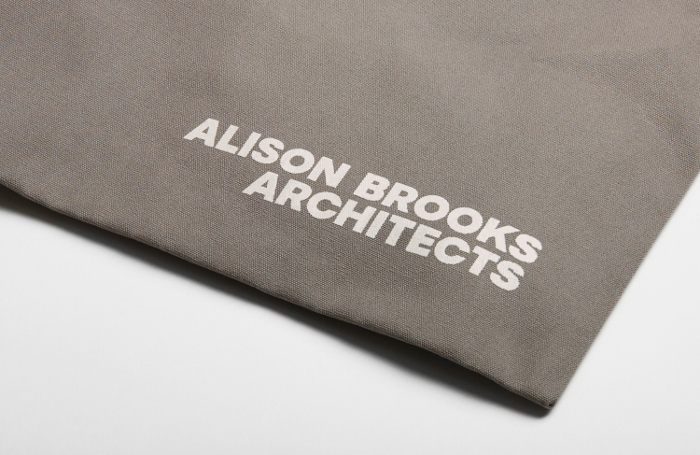
For Alison Brooks Architects, Praline took on a complete rebranding. The practice had decided to back away from its ‘ABA’ identity and return to using a full name. The exercise started by custom designing the characters for the logo. Alison Brooks now has its own unique typeface, which can be used across the board.
"The practice wanted something that would be strong and generous looking," Tanguy reveals. "As architects like details, we decided to carry on and design every letter."
He counsels practices to remember that there are two audiences for their visual identity: potential new recruits as well as clients. Young architects checking out a website to get a feel for a practice are likely to be even more impressed by a practice that knows how to project its design aesthetic.
Thanks to David Tanguy, Director, Praline.
Text by Neal Morris. This is a Professional Feature edited by the RIBA Practice team. Send us your feedback and ideas
RIBA Core Curriculum Topic: Business, clients and services.
As part of the flexible RIBA CPD programme, Professional Features count as microlearning. See further information on the updated RIBA CPD Core Curriculum and on fulfilling your CPD requirements as an RIBA Chartered Member.
Posted on 5 September 2019.


